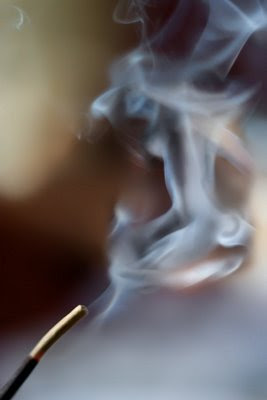
We were encouraged to do any post processing we liked and although I originally didn't think of doing a lot of post-processing, it happened anyway.
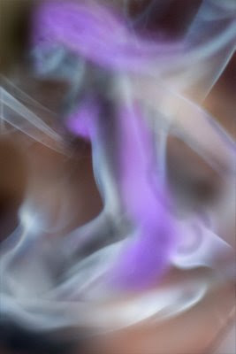
In he final image the drifting smoke looks a lot like a woman kneeling and looking to the left
The setup was basically an incense stick in a holder set on a small table with one of my sons on a couch in the background. The light was through the window to the left, but since it was overcast it wasn't particularly stark.
I took over 100 images some really close and other further away from the incense stick and when I looked at them afterward there were several that looked pretty interesting - some with smoke around the bottom, one that had a small wisp that looked like a face in profile and one of them looked a little like a female torso. It even had a small piece of the hips and top of the thighs.
I wondered how easily I could put them all together to make a composite that looked like a kneeling woman. My first instinct was to use the overlay techniques that I mentioned last week (for the Coyote image that I did) so I went off looking for an image of a woman that I could overlay in there.... Not much luck - the smoke is too translucent to use in overlay (although I am sure there is a way, I couldn't find it).
The next step was to figure out how to make a composite.
There is an important step to making a composite image that many people don't use and that makes a huge difference in flexibility and how much control you have over the final image. This is to never adjust the original image, but rather the use "masks" for that purpose.
Photoshop Elements doesn't have "masks" per se, but you can fake a mask by doing the following: Get the image layer and create a blank layer below it. Then use the Layer->Group option on the image layer so that it is grouped to the blank layer below.
An example of this is this one with the end result shown next to it. You paint in black on the bottom layer to bring out the details of the image that is grouped above. If you don't like it, you erase the black and it hides it again.
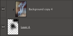
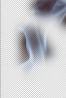
So bringing in three or four of these images and masking parts of them, I ended up with something that looked like a fairly convincing kneeling woman.
The image below is a screenshot from Photoshop Elements showing this and the layers on the right that were used to produce it. You can click on the image to view it large.
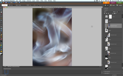
All that was left was to fill in some details to complete the image. The hair looked a little sparse and since this is a woman I needed to manufacture a breast profile and put some detail into the face.
It important to do this in a new layer so that if you make a mistake you can erase it and more importantly, after you are finished if you realize that the overall effect of these additions makes the figure too contrived, you can back it off by reducing the opacity.
I have included a screenshot of this adjusted layer - but I changed the color to make it obvious what these last touchup changes were. If you compare it with the final result you will see that I backed off the touchups quite a bit.


Hi Tim, I am still envious of your command of Photoshop. Which one do you use. I use Elements 6, but I am just learning (and not very fast at that as I do not have much time to play on it)and what you do looks amazing to me. Regards from sunny SA - officially winter today but temperatures were around 24 at midday.
ReplyDeleteThank you for the compliment. I also use Photoshop Elements 6... I found my biggest breakthrough was when I figured out how layers worked!
ReplyDeleteGood luck with the programme for your boss's Uitkla (is that what they call it when a PF person retires?) - I know that is what we called it when we finished our stint in the 70's
Awesome Tim. Thanks for submitting the link to the tutorial group. As I mentioned earlier today, bring em on!! Great job.
ReplyDelete